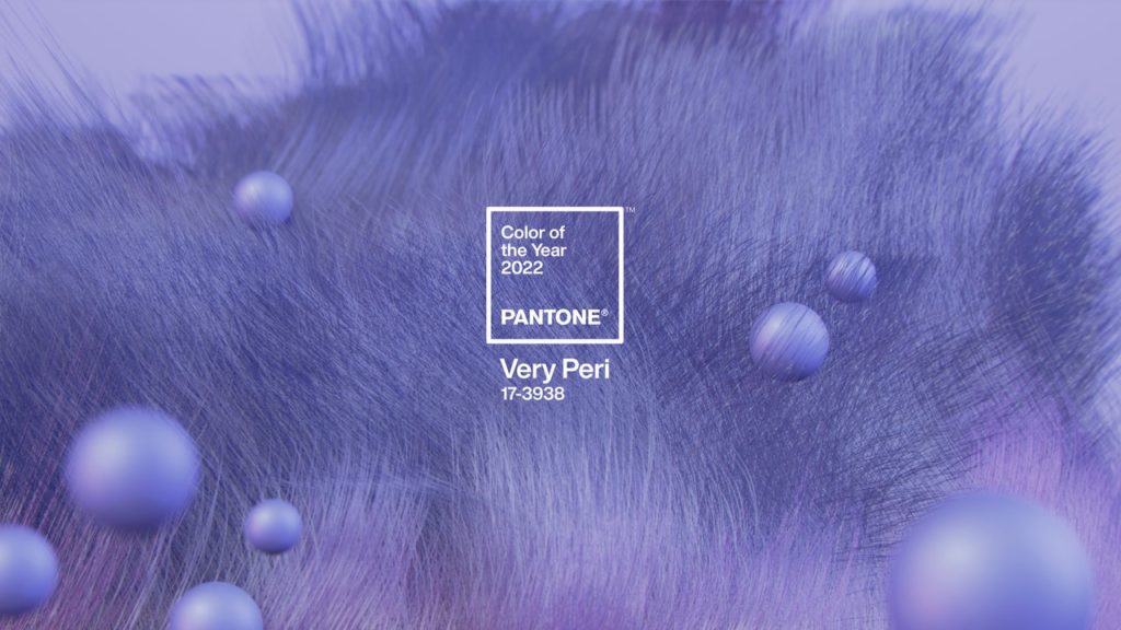
The meaning behind the Pantone Color of the Year 2022
Since its inception, Pantone’s Color of the Year has sought to capture the cultural moment, to reflect the global zeitgeist. The Very Peri color perfectly embodies this temporality. “It embodies a courageous presence and promotes inventiveness and personal creativity,” says Lee Eiseman, the Pantone Color Institute executive director.
“If there was ever a historical moment when we needed this, it’s today. We need this encouragement; we need this upliftment.” This complex hue is considered a member of the blue family, generally regarded as familiar, consistent, and comfortable. However, by infusing it with a shade of purple-red, it gains energy and vibrancy, says Eiseman. This combination of cool and warm tones is both modern and unexpected, a true reflection of the kind of innovation this moment in history calls for. “It helps us embrace the future and the possibilities as we rewrite our lives,” Eiseman proclaims.
Very Peri symbolizes the need for creative solutions and the courage to meet the unprecedented challenges we face.
Advice from Valentin, artistic director:
Valentin’s advice to enjoy the Very Peri color: “Be experimental, have fun, and it will bring you more joy.”

